Add to collection
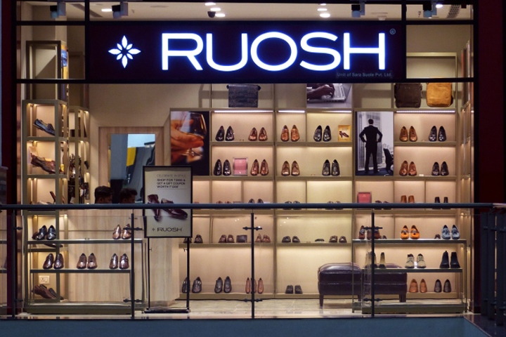

“Ruosh” an existing Men only shoe brand anchored on English heritage, proposed to re-do their Retail Image for New age Men and soon to launched Women range. The objective being to capture the Millenials and New age Men on one side and Unisex appeal on other. The Retail store will also go beyond Shoes and will cater to Lifestyle of customers.
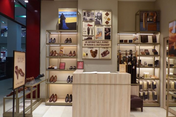
“Ruosh” in sanskrit means “passion”. It is this passion for what is good and the craft of making good shoes is what Ruosh stands for. The concept of the store design was inspired by ‘New Age Global Capitals” and “Everyday for Everyone”. Design through “Simplicity”, “Clutter Free” and “For All” formed a language for the overall architecture and fixtures. Breaking codes of typical shoes display and creating a structured panorama of displays through simple geometrically proportioned units created a rythmic and harmonized design for the brand.
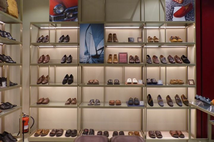
What appeals to Global young customer formed a basis of canvas on which all design ideas were shaped. Mathematically designed fixtures, Proportioned display and units, and a sense of cubism. Graphical representation of Craft which goes in making of Shoes, Minimal metal linear sections forming fixture elements, embedded linear lights for each display, neutral floor provided a setting for the design.
Design: FRDC


Add to collection